I thought that this morning I would challenge my approach to doing 'pleasing color' ok's. I usually just accept the process ink colors the printer is using, assuming that they are 'close enough', and that there isn't very much I can do about it anyway. I was curious about how close they really are to ISO standard.
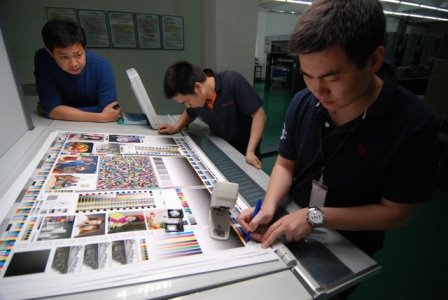
During this past week, I've done 3 'walk-in' color ok's at two different printers. These jobs were nothing special; the client just expected a nice looking job that was fairly close to the proof. (As Miles Southworth used to say "Clean and bright is always right").
Neither printer used any measuring instruments at press. I encouraged them to match the printed sheet to the color bar proof first, before comparing the proof and press sheet images.
Out of curiosity, today I pulled out a few sample sheets from those runs to measure the L*a*b* readings of the ink colors. I was quite surprised.
(EyeOne; Delta E 2000: difference from ISO published standard)
1. Paper:
Printer A Printer B
94.8 0.7 -1.32 94.6 0.3 -1.2
2. Process ink colors:
Printer A Printer B
Cyan 56.8 -35.1 -49.0 DE 1.86 53.3 -34.3 -52.7 DE 4.47*
Mag 48.4 71.6 -5.4 DE 1.59 48.7 74.1 -3.0 DE 1.06
Yel 88.1 -5.3 87.0 DE 0.67 88.0 -6.4 90.5 DE 1.13
Blk 17.0 0.2 0.2 DE 0.68 14.8 -0.2 0.9 DE 1.55
(*the operator was pushing the Cyan density a bit too much).
3. Overprints:
Only one set of press sheets had measurable overprint patches (printer B):
Blk 17.0 0.2 0.2 DE 0.68 14.8 -0.2 0.9 DE 1.55
(*the operator was pushing the Cyan density a bit too much).
3. Overprints:
Only one set of press sheets had measurable overprint patches (printer B):
M+Y 48.9 67.3 46.7 DE 1.93
C+M 23.3 23.4 -47.0 DE 3.80
C+Y 47.6 -65.8 19.7 DE 3.17
Perhaps a lower cyan SID would have also reduced the Delta E for the C+M and C+Y overprints.
Bottom line: I was impressed with how closely we matched ISO standard colors and overprints. Actually, I was shocked at how close the numbers were to the ISO standard without making any special effort to measure and hit them! We simply asked the operator to eyeball a match to the gray balance, tone and solids in the color bar. I belive this result gives some credence to the validity of this simplifed approach to non-critical work.


1 comment:
Good review!!! I read your blog some line are touch my heart.Thanks
printing companies in ft Laudedale
Post a Comment