What is G7 and what does it mean to you?

IIDEAlliance's G7 is a revolutionary new methodology for calibrating proof-to-press and press-to-press across any printing method.


Developed by our industry's leading color experts, the G7 methodology includes revolutionary techniques for dramatically improving print quality and consistency. 


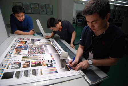
As G7 'Experts', we can provide step-by-step training within your company to calibrate proofing and printing systems using the latest G7 methodology. 


G7 methods have been adopted worldwide: files and proofs created anywhere in the world using the G7 methods, can be matched in any pressroom.


For your business, this means improved color fidelity, press sheets that match the proof resulting in quicker make-readies, faster time-to-market, and lower manufacturing costs. 


Take the first simple steps toward better printing: contact us at Cathay America: jpasky@gmail.com

G7 on a Post-it Note

A guide to getting repeatable color matches on press, everyday

The G7 methodology has been critisized as being 'too complicated'.
It is not. 
Here is a very nice summary of the process that was orignially published by Glenn Andrews of Schawk in Los Angeles. (with a couple of small changes of mine).

1. Use good paper and good ink.
2. Have the press in good running condition.
3. Include color bars with solids, overprints, a 50%C 40%M 40%Y neutral and a 50% or 53% midtone K patch.
4. Run to industry-standard solid ink densities.
5. Mid-tone density must be 0.54 plus the density of the paper.
6. 50%C 40%M 40%Y neutral must be exactly the same color and value as the mid-tone K.

A press sheet run to these specifications will match a good proof.

Wednesday, October 1, 2008

Lucky? or just good!

In my previous post, and in talking about 'G7 on a Post-it Note', I made a comment in which I said that I usually don't pay a lot of attention to the cym ink colors being used. If they don't look weird, they are probably alright. On occasion, I have seen a couple of ink sets with 'chrome' yellow and greenish cyan, but for the most part, the inks have been pretty 'conventional'.

I thought that this morning I would challenge my approach to doing 'pleasing color' ok's. I usually just accept the process ink colors the printer is using, assuming that they are 'close enough', and that there isn't very much I can do about it anyway. I was curious about how close they really are to ISO standard.

During this past week, I've done 3 'walk-in' color ok's at two different printers. These jobs were nothing special; the client just expected a nice looking job that was fairly close to the proof. (As Miles Southworth used to say "Clean and bright is always right"). 

Neither printer used any measuring instruments at press. I encouraged them to match the printed sheet to the color bar proof first, before comparing the proof and press sheet images.

Out of curiosity, today I pulled out a few sample sheets from those runs to measure the L*a*b* readings of the ink colors. I was quite surprised.

(EyeOne; Delta E 2000: difference from ISO published standard)

1. Paper: 
Printer A                       Printer B   
94.8  0.7  -1.32             94.6  0.3  -1.2

2. Process ink colors:

Printer A                                          Printer B  
Cyan  56.8   -35.1  -49.0  DE 1.86      53.3  -34.3  -52.7  DE 4.47*

Mag   48.4   71.6    -5.4   DE 1.59       48.7   74.1    -3.0   DE 1.06

Yel     88.1   -5.3     87.0   DE 0.67      88.0   -6.4    90.5   D1.13

Blk     17.0     0.2     0.2     DE 0.68      14.8   -0.2   0.9      DE 1.55
(*the operator was pushing the Cyan density a bit too much).

3. Overprints:
Only one set of press sheets had measurable overprint patches (printer B):

M+Y   48.9    67.3   46.7    DE  1.93
C+M   23.3    23.4   -47.0   DE  3.80
C+Y    47.6   -65.8   19.7    DE  3.17
Perhaps a lower cyan SID would have also reduced the Delta E for the C+M and C+Y overprints.

Bottom line: I was impressed with how closely we matched ISO standard colors and overprints. Actually, I was shocked at how close the numbers were to the ISO standard without making any special effort to measure and hit them! We simply asked the operator to eyeball a match to the gray balance, tone and solids in the color bar.  I belive this result gives some credence to the validity of this simplifed approach to non-critical work.
1 comment:

Albert said...

Good review!!! I read your blog some line are touch my heart.Thanks

printing companies in ft Laudedale