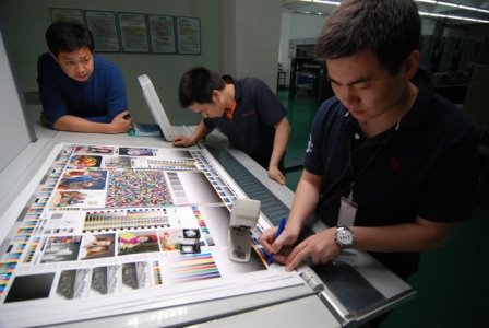
In a press-form color bar there are a good many test objects that indicate something about the mechanical performance of the press. I have been discussing a simplified colorbar in which these mechnaical indicators are replaced with more visual elements.

One of the most common is the GATF Star Target. It's been around a long time. I'm guessing that it's origins were in photographic resolution targets, but in the late 1940s or early 1950s engineers at Western Printing and Lithographing Company in Wisconsin appear to have re-created it for the printing industry. (I happened to see some of the original art-work). The Star Target began life at LTF (Lithographic Technical Foundation) which later became the GATF. The Star Targets followed along.
The Star Target amplifies the effect of gain, slur, doubling, paper movement, (35 to 1, if I recall correctly), so that small distortions in print can be easily seen by the operator. The indicator is visual; there is no way to quantify the result.
In trying to simplify the color bar I was designing for my approach to G7, I chose to eliminate all the mechanical diagnostic indicators that reported the condition of the press itself. I was interested in the printed result, mostly the gray balance. In the interest of making best use of the limited space, I replace the venerable Star Target with a visual indicator of tone and balance instead.


1 comment:
the much-maligned G7 method. G7 seems
GPS Navigation to have embraced and refined the early work of research pioneers, adapting these ideas for today's electronics-dominated printing industry. Film-positive originals were the image source in Brunner's day. G7 depends heavily on the flexibility and precision of the modern CtP plate-making systems, spectros, RIPS and .pdf source files.
Post a Comment