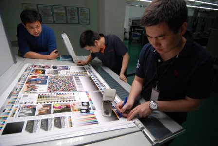
Earlier this week I was posting a few thoughts at Adam Dewitz's PrintCEOblog (www.printCEOblog.com) I was explaining my thinking behind the simplified press color bar that I use when doing color ok's for clients here in China. Few printers here run control bars. I'm sure that 1/4" of paper at the tail-end of the sheet is their profit margin. In any case, most are 'eyeballing' the sheet to the proof. They don't do a bad job, but they are making the assumption that the proof represents the file and that the press can actually print what's on the proof.

When I'm 'shepherding' books through the manufacturing process, I first check their proofs for compliance with the ISO standard by insisting that they make me a proof of the Idealliance proofing bar. I check it with my EyeOne. I like to see the proof as close as possible to a Delta E of 1.0. If they are making good proofs, we're half-way home!. I then have them proof the job and send it to my client for his approval.
When we're ready to print, I ask them to include my press control bar on the forms. I also ask them to make a proof the color bar. I ask the press operator to begin by matching the color bar on the sheet to the color bar proof. This way I know that the press is printing a good gray balance and that the tone reproduction is correct.

After the bar looks good on the presssheet, we can start fine-tuning the images, but typically there is very little adjustment that needs to be made to match the proof.
In using this simplified technique on press, I have to make the assumption that the inks are close to ISO requirements. I'm not in a situation where I can tell them to change ink if they are 'off' a bit. The inks being used in most printing plants are so close to 'standard' that any differences will be very minor. As a matter of fact, in checking through a stack of sample press sheets that I've run this past year, all of the ink sets are within the ISO tolerance.
 When I'm 'shepherding' books through the manufacturing process, I first check their proofs for compliance with the ISO standard by insisting that they make me a proof of the Idealliance proofing bar. I check it with my EyeOne. I like to see the proof as close as possible to a Delta E of 1.0. If they are making good proofs, we're half-way home!. I then have them proof the job and send it to my client for his approval.


1 comment:
That statue is very detailed. I wonder if it comes to life at night, when you're not around.
fort lauderdale printers
Post a Comment