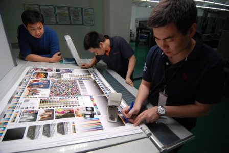

In my files, I recently found this proofing bar that was developed by Felix Brunner for the DuPont's Cromalin proofing system. The copyright date is 1983, so I'm guessing that the printed image is from sometime in the mid to late 80s. Brunner created some unique test elements to help manage color reproduction in proofs and press sheets. I will talk about those a little later. Seeing this 'ancient' bar reminded me of something I had learned earlier this year that I thought was very interesting:
A few months ago, I was assisting a SystemBrunner instructor in demonstrating process control strategies for Instrument Flight. To illustrate his points, he used an image that was printed by Felix Brunner many decades ago. The picture was accompanied by a color bar very similar to the one pictured above.
I happened to have a spectrodensitometer at hand and was curious about the density of the 3-color and black gray patches. While the technique of monitoring the midtone density value was not part of the Brunner control strategy, it IS defined as an important target in the new G7 methodology.
I was somewhat startled to find that in measuring the midtone (50/41/41) patch of this 20 year-old color bar, the density was, in fact, 0.54 above paper: precisely the same target density prescribed by G7 as the 50/40/40 midtone value on the Neutral Print Density Curve (NPDC).
So, it appears that the same elements of good printing haven't changed. In order of priority: balance, tone, and color.
To my mind, this very early Brunner work validates the much-maligned G7 method. G7 seems to have embraced and refined the early work of research pioneers, adapting these ideas for today's electronics-dominated printing industry. Film-positive originals were the image source in Brunner's day. G7 depends heavily on the flexibility and precision of the modern CtP plate-making systems, spectros, RIPS and .pdf source files. But, the process techniques and tools that Brunner developed many years ago, and the G7 methods of today, have the same ultimate objective: to reproduce high-quality color images on paper.


No comments:
Post a Comment