What is G7 and what does it mean to you?

IIDEAlliance's G7 is a revolutionary new methodology for calibrating proof-to-press and press-to-press across any printing method.


Developed by our industry's leading color experts, the G7 methodology includes revolutionary techniques for dramatically improving print quality and consistency. 


As G7 'Experts', we can provide step-by-step training within your company to calibrate proofing and printing systems using the latest G7 methodology. 


G7 methods have been adopted worldwide: files and proofs created anywhere in the world using the G7 methods, can be matched in any pressroom.


For your business, this means improved color fidelity, press sheets that match the proof resulting in quicker make-readies, faster time-to-market, and lower manufacturing costs. 


Take the first simple steps toward better printing: contact us at Cathay America: jpasky@gmail.com

G7 on a Post-it Note

A guide to getting repeatable color matches on press, everyday

The G7 methodology has been critisized as being 'too complicated'.
It is not. 
Here is a very nice summary of the process that was orignially published by Glenn Andrews of Schawk in Los Angeles. (with a couple of small changes of mine).

1. Use good paper and good ink.
2. Have the press in good running condition.
3. Include color bars with solids, overprints, a 50%C 40%M 40%Y neutral and a 50% or 53% midtone K patch.
4. Run to industry-standard solid ink densities.
5. Mid-tone density must be 0.54 plus the density of the paper.
6. 50%C 40%M 40%Y neutral must be exactly the same color and value as the mid-tone K.

A press sheet run to these specifications will match a good proof.

Monday, November 17, 2008

Mythbuster?

In a continuing to think about how ink-sets around the world seem to be more similar that different, I tripped across another interesting set of numbers while cleaning out some old files. I fed these into my color comparison software to see what the differences would read.

Following is a comparison of Japan Color Standard vs. the recommended ISO L*a*b* values:

ISO

c    55   -37   -50  
m   48     74    -3
y    89    -5     93

Japan Color
c    52   -36   -49
m   47    75    -3
y    87    -5     88

ISO
R    47    68   48  
G    50   -68   25
B    24     27  -46

Japan Color
R    47    69   46  
G    47   -68   23
B    21     22  -47
Comparing the two standards, here are the delta E values I got:
c    1.62
m   1.01
y    1.62
R   1.14
G   3.09
B   3.58
(btw...Japan Color Standard for black is 16.5 vs. ISO of 16.0)

All these readings are well within the published tolerances: ISO <5.0 and Japan Color <6.0
I've always been told that inks from Japan are 'different' from the inks we use in the States.
 Is this comparison of the published standards a 'mythbuster' ? 
I'd be interested in your comments.

Thursday, November 13, 2008

ISO Standard Ink Colorants


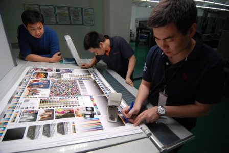
One thing I hear quite often is that, "we can't follow standards in China because our inks are different." Frankly, I haven't noticed this at all. Process inks that I've seen at the printers I visit are pretty run-of-the-mill colorants; nothing special. Measuring these process colors on many of the test forms that are piled on the floor of my office, confirms this.

Today I was cleaning out files, when I came across a swatch book from an ink maker I've never heard of before. I recall picking it up at one of the trade shows a couple of years ago. The process colors didn't look quite right, so just for fun I measured them against the ISO standard.

I was surprised that the process colors were indeed within the ISO tolerance which allows a delta E of 5.0. (ok, I must confess I had to 'cheat' a little bit on the cyan, but here are the numbers):

The magenta ink was called Rhodamine Red:
48.9  77.8  -11.9
...which measured a delta E of 4.07

The yellow:
87.6  -1.2   110.8
...for a delta E of 4.72.

That b* reading is pretty high when compared to the ISO target value of 88.2, but according to the new G7 guidance, the b* value of yellow ink is more sensitive to IFT variation than the L*. It appears that if the IFT on the color swatch was run a lighter, we could anticipate a new b* reading closer to 100 and would have resulted in a delta E value of 3.2 or less. If it were 90, the dE could have been 2.5 or less.

Cyan:
48.4  -35.0   51.4
This reading results in a delta E of 9.03. Is quite high and, at first glance, would appear to be unacceptable. But, looking more closely at the L* value and the swatch itself, it's clear that the IFT of the cyan ink swatch was run much too heavy. If by running less ink, we were to increase the L* value so it was closer to the ISO target value of L*= 57.3, the delta E would have been closer to 2.50.

I guess my point is that, this process ink-set made by 'Top Star' Ink Company is not as 'off target' as it first might appear looking at their swatch book; they just didn't do a good job of printing the swatches. (Laying down more ink to get more 'color' is not always better.) Right out-of-the-can, the ink looks like it would be passable as an ISO-compliant ink for G7 calibration purposes if the inks were run at the correct IFT. Once gray balance and tone reproduction is adjusted, the slight difference in the color of the process inks from ISO standards would be inconsequential.

This was just a quick look at one old swatch book from an unknown ink company, but the ink colorants were close enough to ISO standard tolerance to be successfully used for G7. I still haven't been convinced of the argument: "...we can't print to standard here in China...we have too many different inks..."

Friday, October 3, 2008

Star Targets

In a press-form color bar there are a good many test objects that indicate something about the mechanical performance of the press. I have been discussing a simplified colorbar in which these mechnaical indicators are replaced with more visual elements. 

One of the most common is the GATF Star Target. It's been around a long time. I'm guessing that it's origins were in photographic resolution targets, but in the late 1940s or early 1950s engineers at Western Printing and Lithographing Company in Wisconsin appear to have re-created it for the printing industry. (I happened to see some of the original art-work). The Star Target began life at LTF (Lithographic Technical Foundation) which later became the GATF. The Star Targets followed along.


The Star Target amplifies the effect of gain, slur, doubling, paper movement, (35 to 1, if I recall correctly), so that small distortions in print can be easily seen by the operator. The indicator is visual; there is no way to quantify the result.


In trying to simplify the color bar I was designing for my approach to G7, I chose to eliminate all the mechanical diagnostic indicators that reported the condition of the press itself. I was interested in the printed result, mostly the gray balance. In the interest of making best use of the limited space, I replace the venerable Star Target with a visual indicator of tone and balance instead.

Wednesday, October 1, 2008

Lucky? or just good!

In my previous post, and in talking about 'G7 on a Post-it Note', I made a comment in which I said that I usually don't pay a lot of attention to the cym ink colors being used. If they don't look weird, they are probably alright. On occasion, I have seen a couple of ink sets with 'chrome' yellow and greenish cyan, but for the most part, the inks have been pretty 'conventional'.

I thought that this morning I would challenge my approach to doing 'pleasing color' ok's. I usually just accept the process ink colors the printer is using, assuming that they are 'close enough', and that there isn't very much I can do about it anyway. I was curious about how close they really are to ISO standard.

During this past week, I've done 3 'walk-in' color ok's at two different printers. These jobs were nothing special; the client just expected a nice looking job that was fairly close to the proof. (As Miles Southworth used to say "Clean and bright is always right"). 

Neither printer used any measuring instruments at press. I encouraged them to match the printed sheet to the color bar proof first, before comparing the proof and press sheet images.

Out of curiosity, today I pulled out a few sample sheets from those runs to measure the L*a*b* readings of the ink colors. I was quite surprised.

(EyeOne; Delta E 2000: difference from ISO published standard)

1. Paper: 
Printer A                       Printer B   
94.8  0.7  -1.32             94.6  0.3  -1.2

2. Process ink colors:

Printer A                                          Printer B  
Cyan  56.8   -35.1  -49.0  DE 1.86      53.3  -34.3  -52.7  DE 4.47*

Mag   48.4   71.6    -5.4   DE 1.59       48.7   74.1    -3.0   DE 1.06

Yel     88.1   -5.3     87.0   DE 0.67      88.0   -6.4    90.5   D1.13

Blk     17.0     0.2     0.2     DE 0.68      14.8   -0.2   0.9      DE 1.55
(*the operator was pushing the Cyan density a bit too much).

3. Overprints:
Only one set of press sheets had measurable overprint patches (printer B):

M+Y   48.9    67.3   46.7    DE  1.93
C+M   23.3    23.4   -47.0   DE  3.80
C+Y    47.6   -65.8   19.7    DE  3.17
Perhaps a lower cyan SID would have also reduced the Delta E for the C+M and C+Y overprints.

Bottom line: I was impressed with how closely we matched ISO standard colors and overprints. Actually, I was shocked at how close the numbers were to the ISO standard without making any special effort to measure and hit them! We simply asked the operator to eyeball a match to the gray balance, tone and solids in the color bar.  I belive this result gives some credence to the validity of this simplifed approach to non-critical work.

My approach to G7 on a Post-it Note

Earlier this week I was posting a few thoughts at Adam Dewitz's PrintCEOblog (www.printCEOblog.com) I was explaining my thinking behind the simplified press color bar that I use when doing color ok's for clients here in China. Few printers here run control bars. I'm sure that 1/4" of paper at the tail-end of the sheet is their profit margin. In any case, most are 'eyeballing' the sheet to the proof. They don't do a bad job, but they are making the assumption that the proof represents the file and that the press can actually print what's on the proof.

When I'm 'shepherding' books through the manufacturing process, I first check their proofs for compliance with the ISO standard by insisting that they make me a proof of the Idealliance proofing bar. I check it with my EyeOne. I like to see the proof as close as possible to a Delta E of 1.0. If they are making good proofs, we're half-way home!. I then have them proof the job and send it to my client for his approval.

When we're ready to print, I ask them to include my press control bar on the forms. I also ask them to make a proof the color bar. I ask the press operator to begin by matching the color bar on the sheet to the color bar proof. This way I know that the press is printing a good gray balance and that the tone reproduction is correct.


After the bar looks good on the presssheet, we can start fine-tuning the images, but typically there is very little adjustment that needs to be made to match the proof. 

In using this simplified technique on press, I have to make the assumption that the inks are close to ISO requirements. I'm not in a situation where I can tell them to change ink if they are 'off' a bit. The inks being used in most printing plants are so close to 'standard' that any differences will be very minor. As a matter of fact, in checking through a stack of sample press sheets that I've run this past year, all of the ink sets are within the ISO tolerance. 


Thursday, September 25, 2008

Some things don't change...


In my files, I recently found this proofing bar that was developed by Felix Brunner for the DuPont's Cromalin proofing system. The copyright date is 1983, so I'm guessing that the printed image is from sometime in the mid to late 80s. Brunner created some unique test elements to help manage color reproduction in proofs and press sheets. I will talk about those a little later. Seeing this 'ancient' bar reminded me of  something I had learned earlier this year that I thought was very interesting:

A few months ago, I was assisting a SystemBrunner instructor in demonstrating process control strategies for Instrument Flight. To illustrate his points, he used an image that was printed by Felix Brunner many decades ago. The picture was accompanied by a color bar very similar to the one pictured above.

I happened to have a spectrodensitometer at hand and was curious about the density of the 3-color and black gray patches. While the technique of monitoring the midtone density value was not part of the Brunner control strategy, it IS defined as an important target in the new G7 methodology.

I was somewhat startled to find that in measuring the midtone (50/41/41) patch of this 20 year-old color bar, the density was, in fact, 0.54 above paper: precisely the same target density prescribed by G7 as the 50/40/40 midtone value on the Neutral Print Density Curve (NPDC).

So, it appears that the same elements of good printing haven't changed. In order of priority: balance, tone, and color.

To my mind, this very early Brunner work validates the much-maligned G7 method. G7 seems to have embraced and refined the early work of research pioneers, adapting these ideas for today's electronics-dominated printing industry. Film-positive originals were the image source in Brunner's day. G7 depends heavily on the flexibility and precision of the modern CtP plate-making systems, spectros, RIPS and .pdf source files. But, the process techniques and tools that Brunner developed many years ago, and the G7 methods of today, have the same ultimate objective: to reproduce high-quality color images on paper.

Friday, September 12, 2008

I LOVE PRINTING!

click here  : I LOVE printing

and this one  : I LOVE GATF!

 and this one : I Love Boxes

Proving beyond any doubt whatsoever, that you have to be absolutely out of your mind to be in the printing business!

joe